
Design Brief:
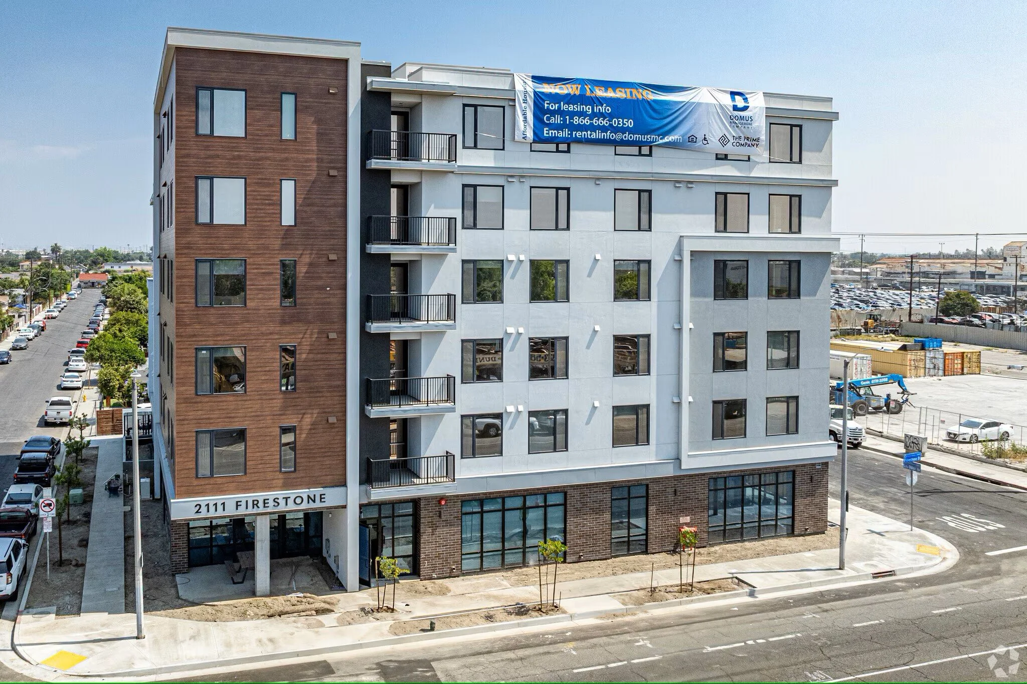
Design exterior and interior signage for an affordable housing property, 2111 Firestone, in Los Angeles California.
—
Photography done by apartments.com
CONTRIBUTIONS:
Signage design


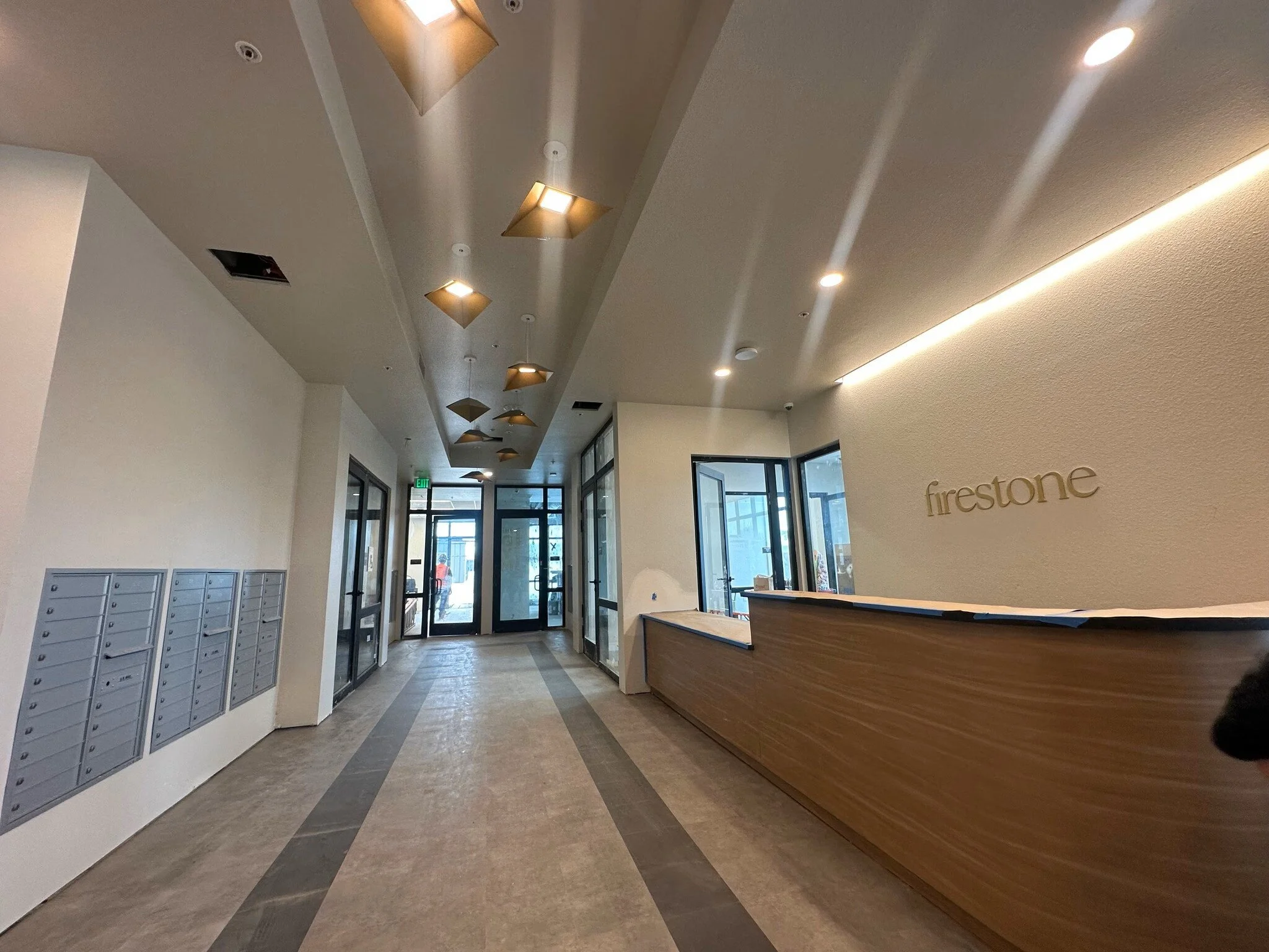
The interior design of the project features simple, geometric shapes with subtle features like chamfers and angles. A particularly good example of this is the furniture you see in the top left image.
Font: The Seasons (lowercase)
The Seasons was chosen for it’s serif characteristics that complimented the rectangular shapes of the building.


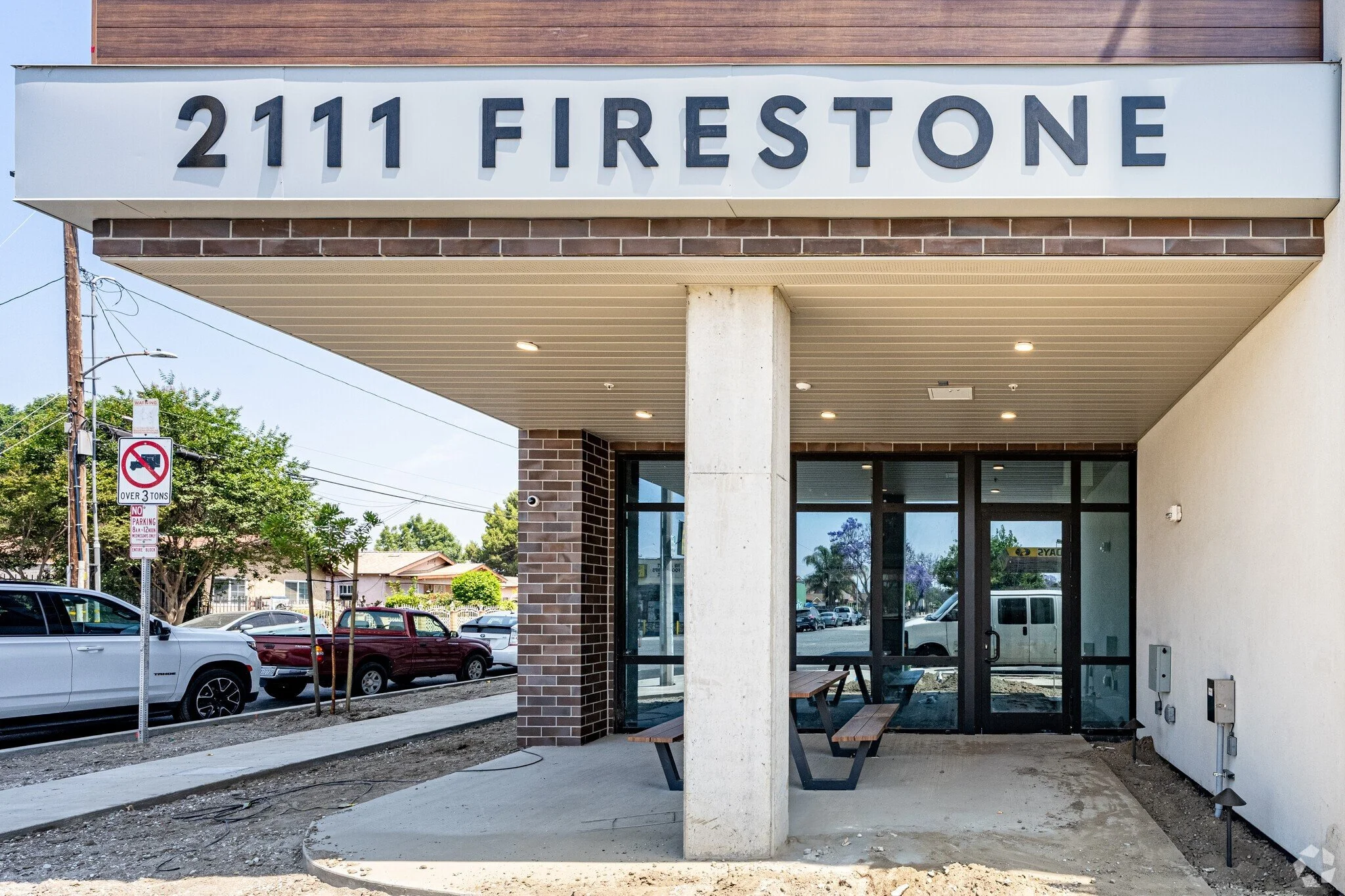
Font: Quasimoda (uppercase)
Quasimoda features a simple, strong, sans serif font that captures the design intent of the project. Here it can be seen on the building signage that greets you at one of the entrances. The subtle chamfers in the “F” and the “E” provide a nice touch of character that alludes to the design decisions made in the interior design.

Fonts: The Seasons (lowercase), Quasimoda
The gym signage features a mixture of the two fonts used in the Firestone brand.