Design Brief:
Create the branding, logo design, and marketing material for a brand new, unique, student housing complex across the street from SDSU students. The brand should reflect the unique characteristics of the building and resonate with SDSU students.
—
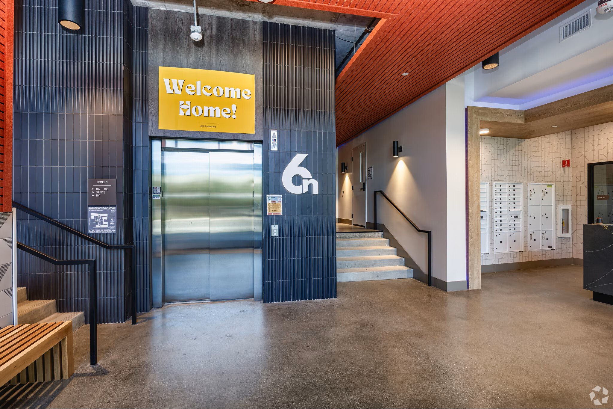
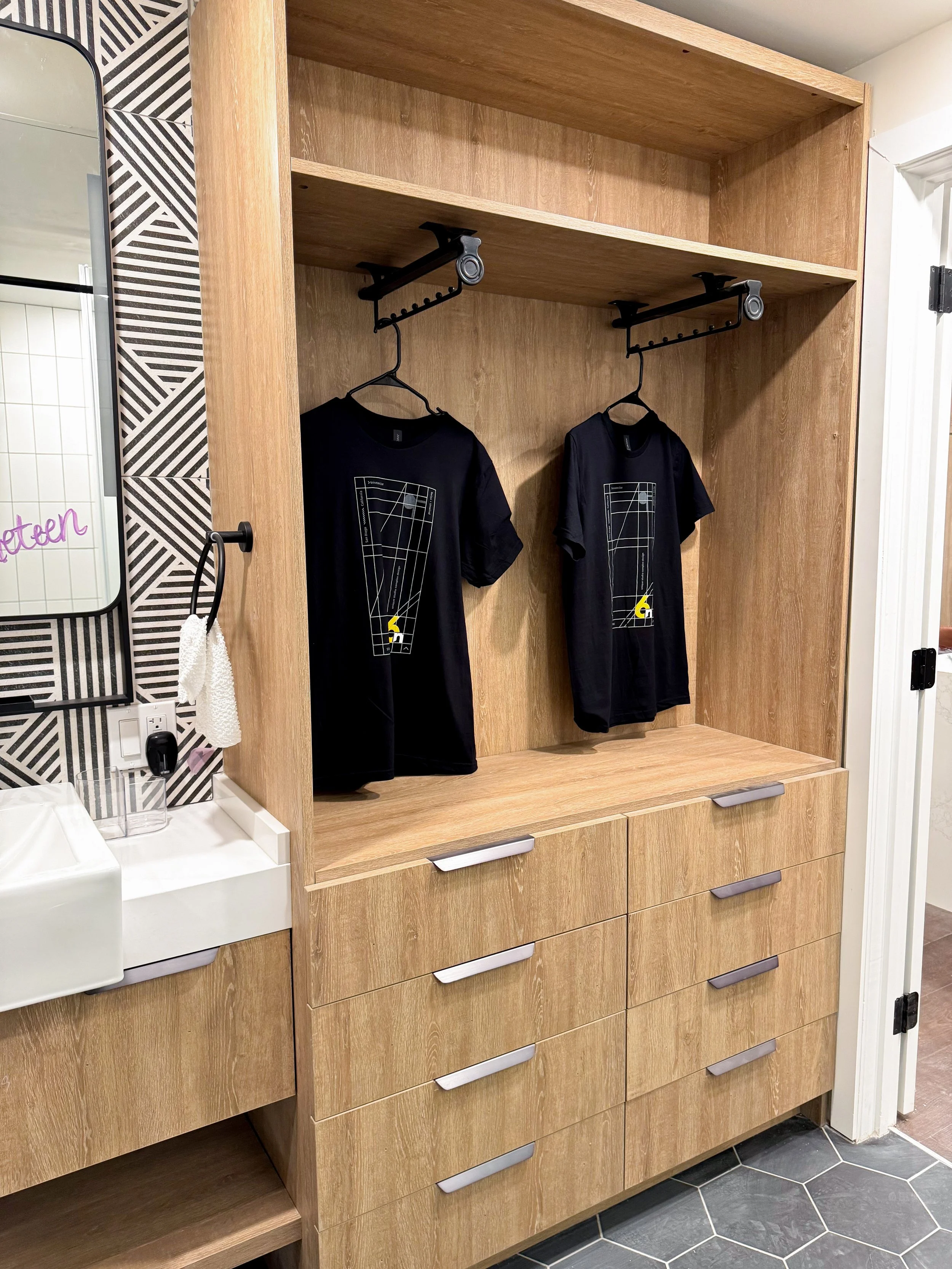
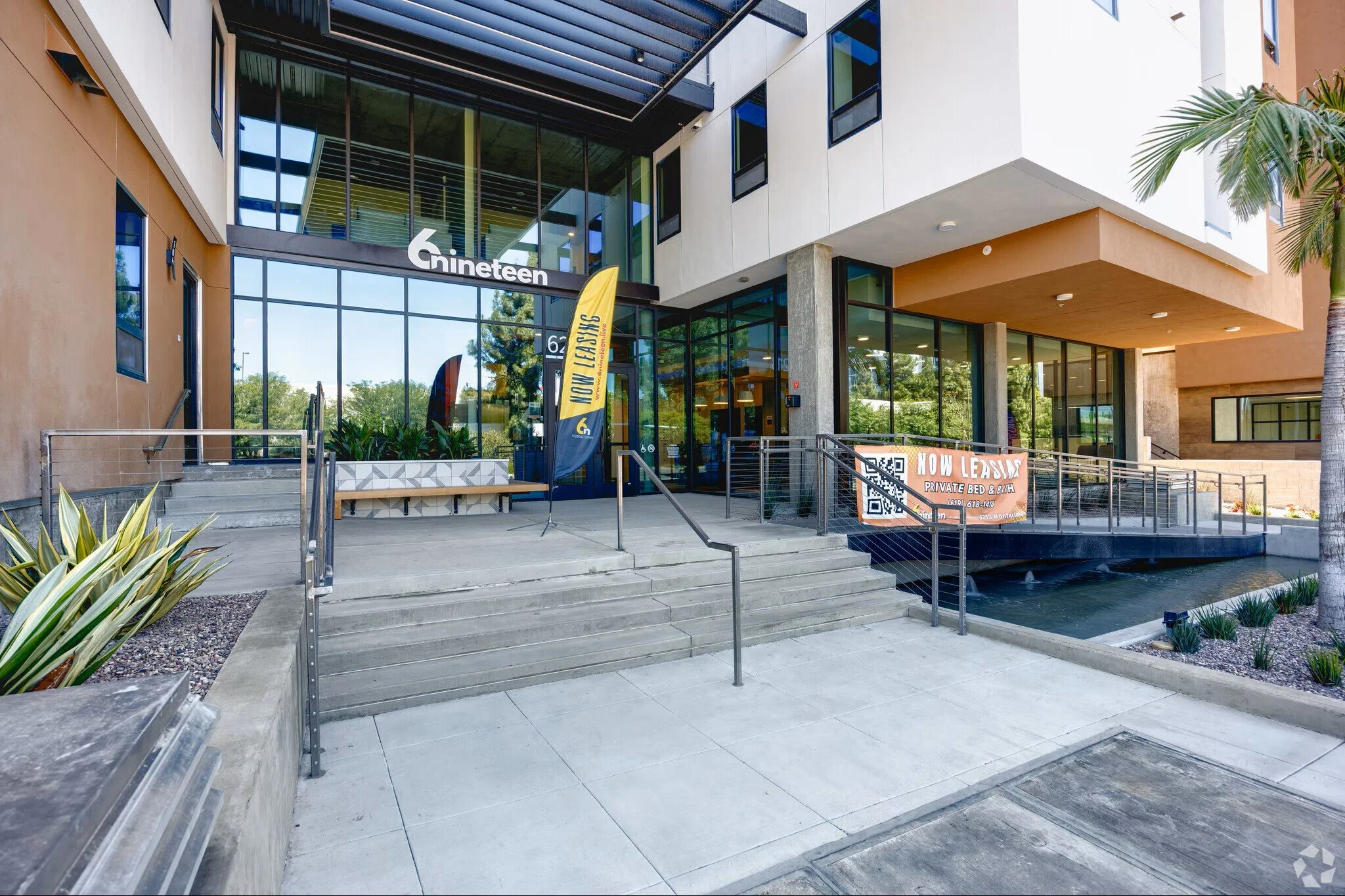
6nineteen photos taken by apartments.com
CONTRIBUTIONS:
Logo design & branding
Merchandise design & coordination
Signage design & coordination
WHEELS AWAY FROM CAMPUS
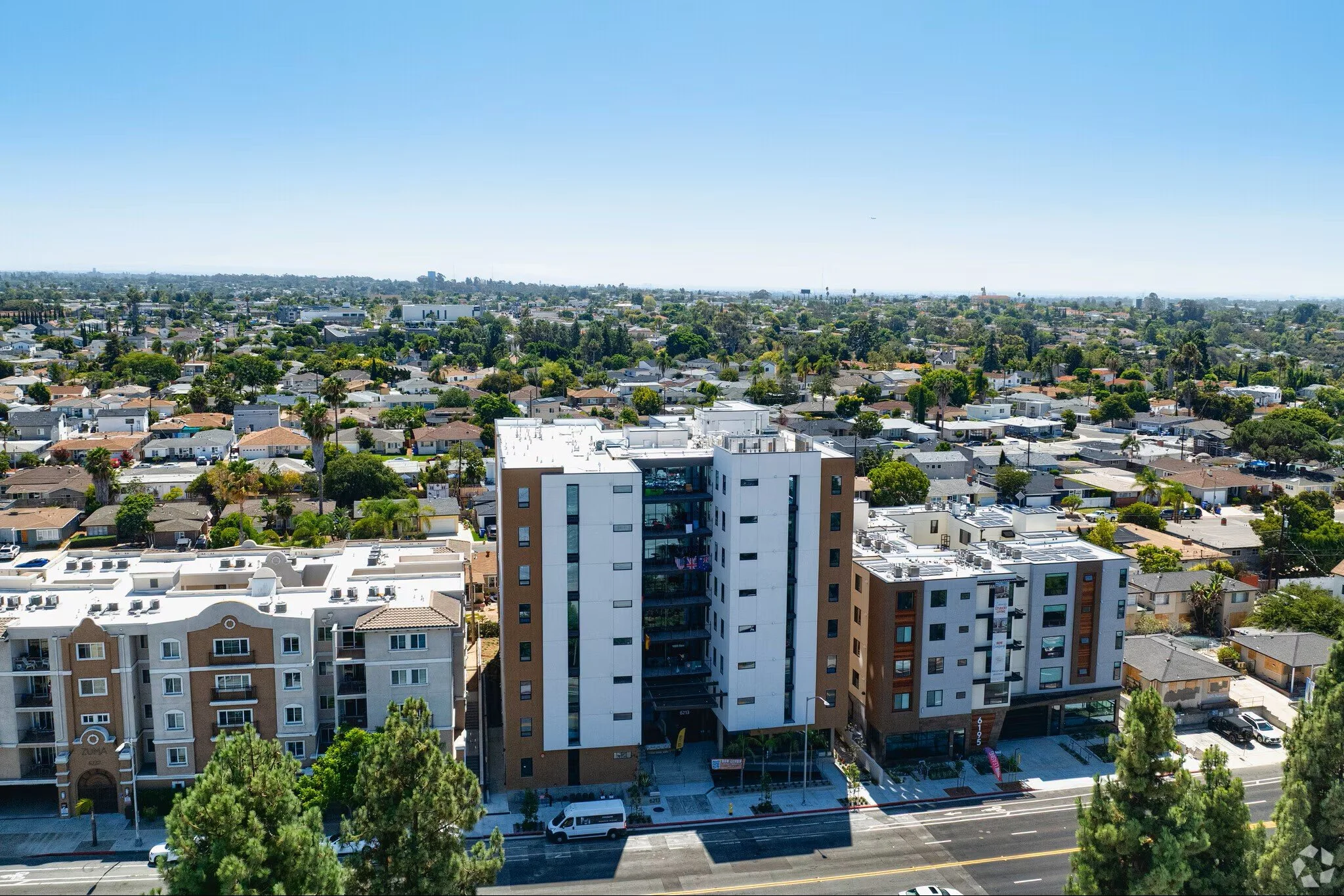
6nineteen lives right across the street from the beautiful San Diego state University (SDSU) campus. As we thought about how 6nineteen would be branded, we considered how the student body at SDSU would perceive the new brand and property.
We wanted students to feel cool repping the 6nineteen brand in their day to day life, almost as if the brand were a clothing line. This tone of voice catered to the demographic and culture at SDSU.
URBAN SURF
Taking inspiration from street style clothing & skateboarding created a new, unique aesthetic. Introducing, Urban Surf.
Urban Surf style can be described as punchy, text & graphic heavy, bold colors mixed with dark tones, and dynamic compositions.


Brand Mark

Horizontal Logo